Pantones are colours – They work the same as paint charts that you use to select a colour for your home. In fact, they pretty much work for the same reasons as well! When you go to paint a wall in your house, you want to choose a colour that works with the house and have it set the right mood for the room. You take a colour chart, pick your colour and the dude at the paint shop mixes it for you exactly as it shows on the paint chart so you don’t get it home and discover your “blue seabreeze” is “barbie pink”
The same principals are applied with your brand, why would you choose a colour that doesn’t match your “home” (business) and not have it set the right mood? pantones allow us to choose the exact right blue / green / yellow etc for your logo and be able to take it to ANY commercial printer and have the same result printed every time.
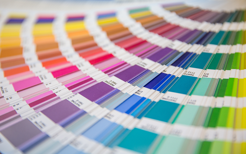
All good designers should be equipped with the right pantone charts and be able to whip them out to discuss colour with you when you meet them to talk over your vision.
Here is how the pantone process works:
 |
A graphic designer is designing an identity package. She looks through a Pantone solid color formula guide (based upon the Pantone Matching System) until she finds a red color she likes. |
 |
She really likes Pantone 199 Red. It’s perfect for the client, and will be used as the primary color for the logo and any identity work that may follow |
 Chip Chip |
She designs the logo, and specifies Pantone 199 red as the primary color for the logo and business cards. The client ok’s the proofs, and the designer sends the job along to the printer, including a Pantone color chip for exact colour reference. |
 |
The printer looks up the color the designer specified (Pantone 199 Red) in the Pantone formula guide, and specifies that color on the job ticket. |
 |
When the job goes to the press, the press operator finds that color (Pantone 199 Red) in their Pantone guide. There is a mixing formula in the guide (circled) for the operator to follow. |
 |
The press operator takes 12 oz. of Pantone Rubine Red ink, and 4 oz. of Pantone Yellow ink, and mixes them together. The resulting ink is Pantone 199 Red. |
 |
Using the ink they just mixed, their Pantone formula guide, and the Pantone color chip as a color standard, the press operator will print the business cards. |
 |
With the Pantone matching system, color consistency is guaranteed, from design to client, to pre press, through the pressroom, to final delivery. It’s that simple. |