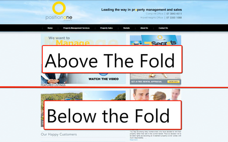
The term “above the fold” came about from that black and white news print thing that our parents read at the breakfast table. Simply put it, it is the information that is always visible when a newspaper is folded in half and lay out in front of you.
The very same term is used on any good website. When people come to your website, it is the FIRST few elements they see of your business and your brand, no matter what size screen or browser they have.
Take a look at your website now, what can you see when it first loads? Do people know exactly what you do? Can they see your logo and your mission statement? When it came time for us to build brandwagon.co.nz, we chose a theme that let us have plenty of room to show off our statement “We create brands that get your customers on board” and our logo. Below that are pages and of course, you can see the top line of projects where our guarantee is.
It’s really important to tell your web designer what you want to feature above the fold, so that when they choose a theme to work with they know exactly which parts of your brand you need your customers to engage with first. It is also a good idea to ask them to ensure these parts are viewable on mobile devices, we call this “responsive” but we’ll touch on this in another post.
Here’s a check list of things you may find important for your website to have above the fold:
- Logo
- Your tagline or mission statement
- Your menu items
- Your contact number or email address
- Your “sponsor us” if you are a charity
- Any special deal button or slide out.
- A featured video button or picture
Not all these things need to be there, but definitely the top 3 on the list should be.
